Tara
real estates
Group
Tara has established a strong presence in the industry by specializing in both commercial and residential building projects as well as public works initiatives.
Client
Tara
Category
Branding/ Visual Identity/ Real estates
Year
2022
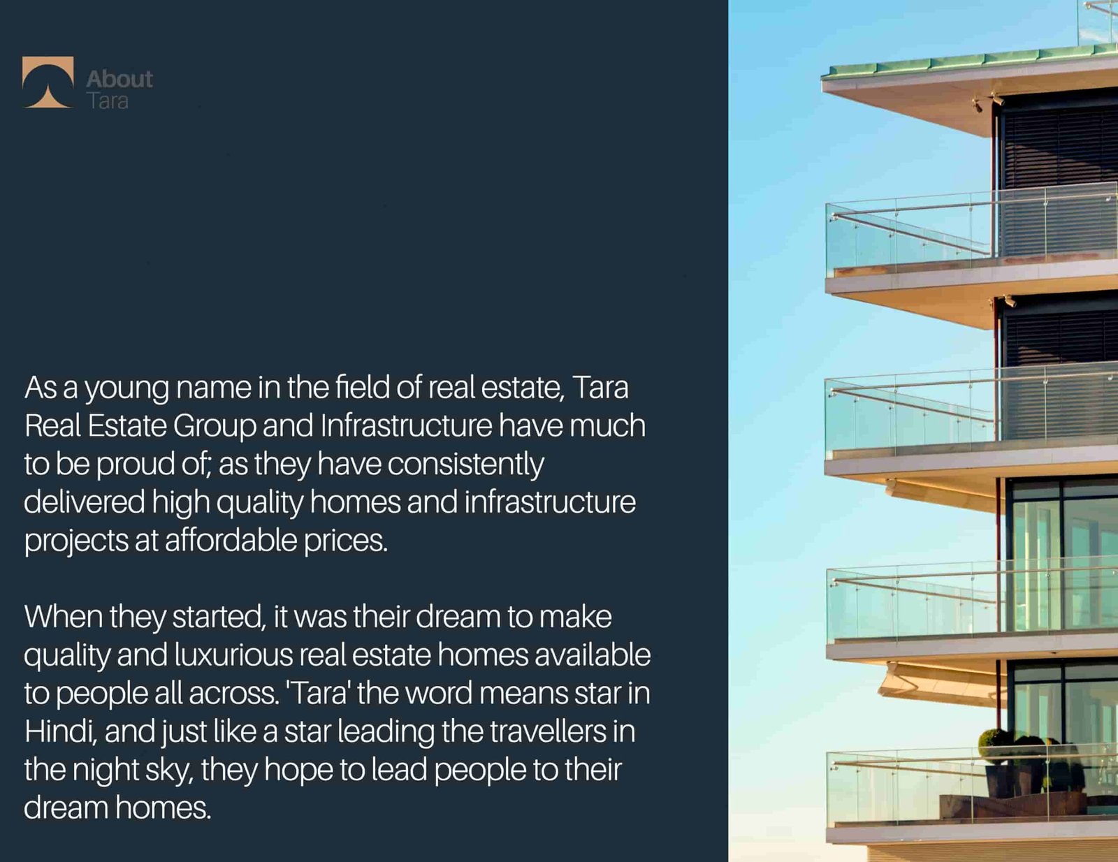
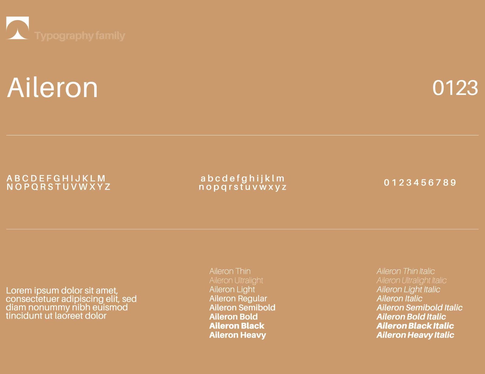
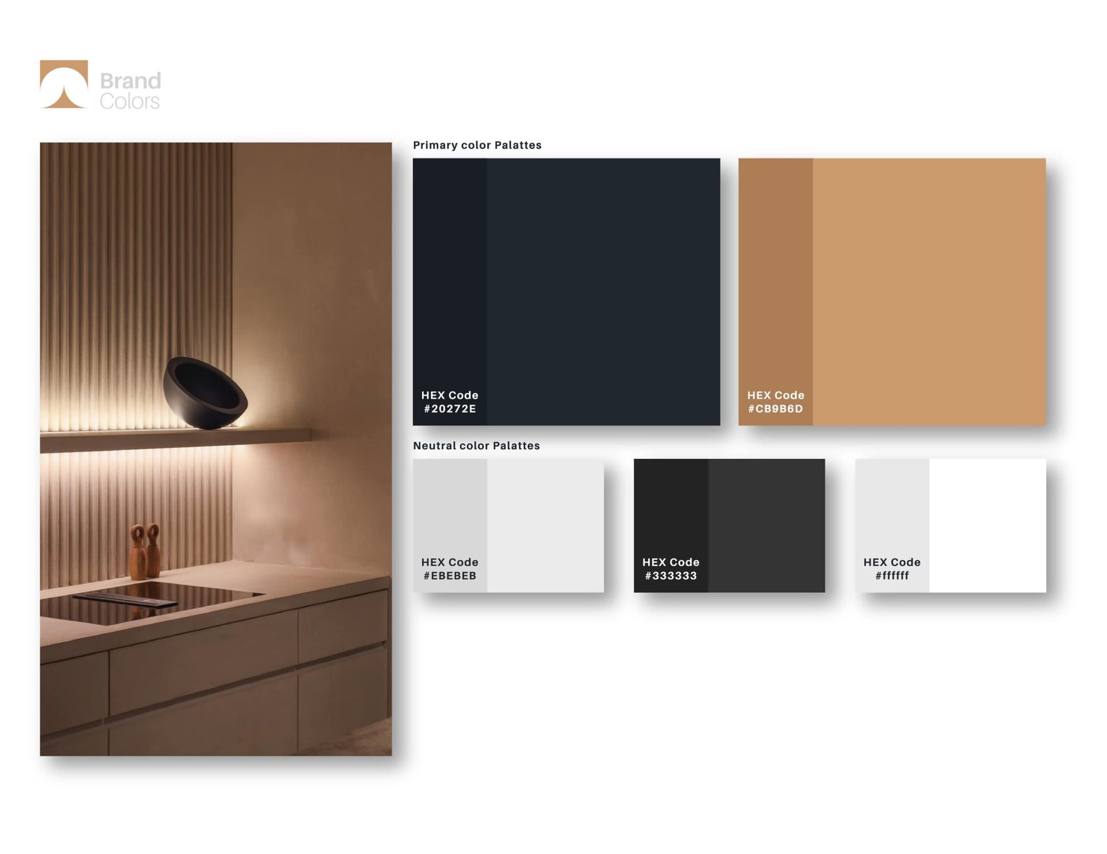

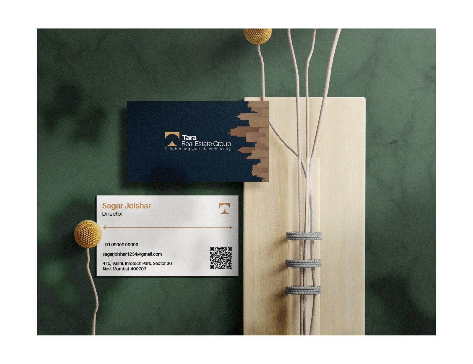
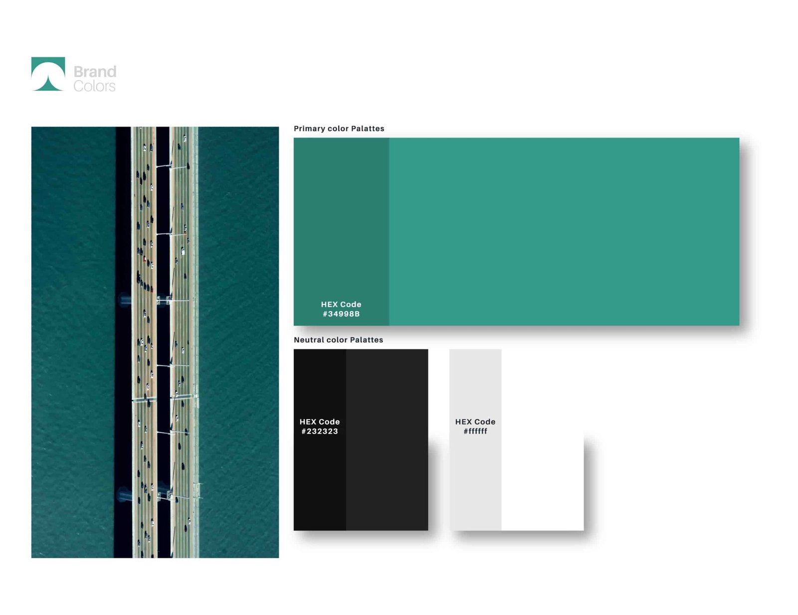
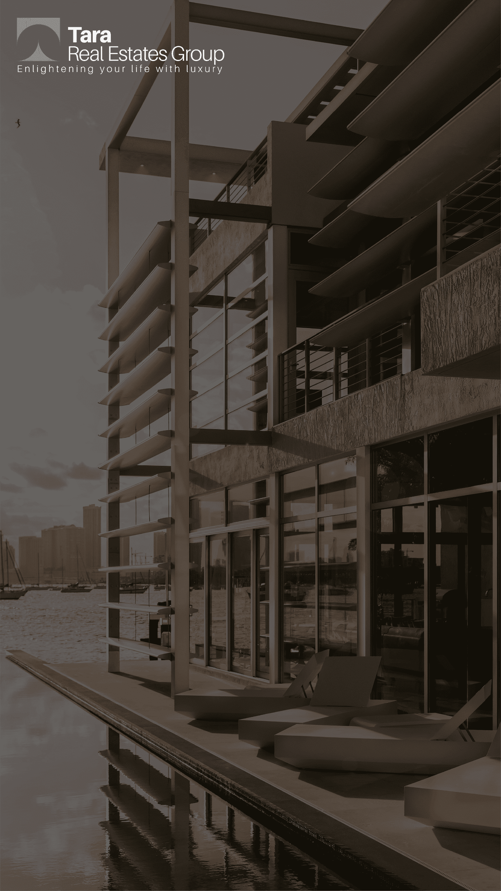
The overall goal was to create the brand in a more upscale market in order to justify the quality and services provided by the client to their clients. We accomplished everything from colour palettes to font choices to ensure the brand stands out in the competitive industry.
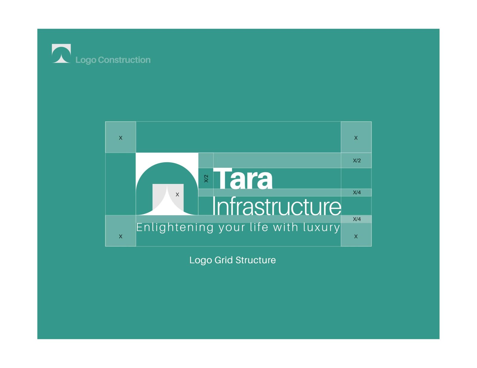

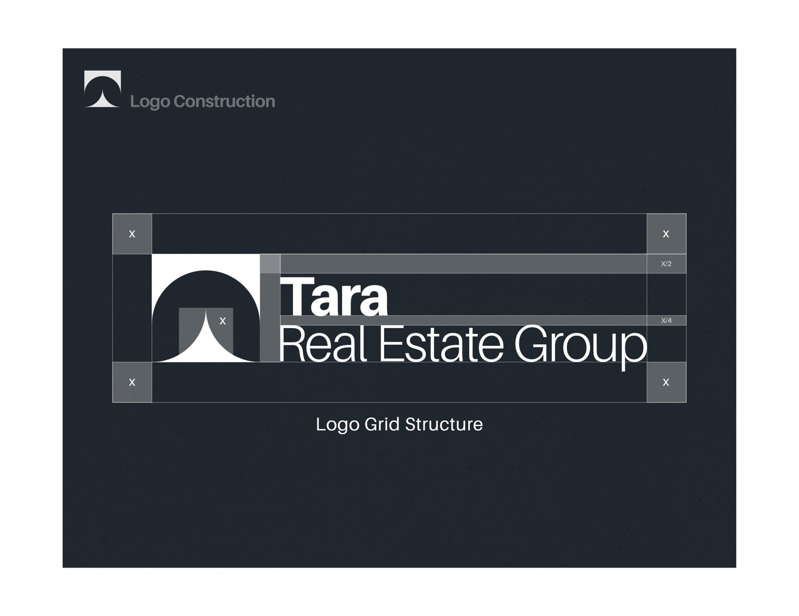
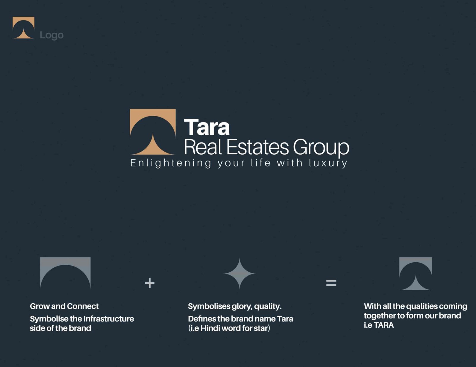
Tara is a Hindi word that means star. So we attempted to incorporate that into the logo while keeping in mind the inclusion of government projects as part of the overall brand. On the left, you can see the visual representation of the logo as well as the thought process behind it.

While most real estate firms settle for generic and geometrical design styles, we were certain that the real estate firm would profit from a simple, memorable, and everlasting symbol.

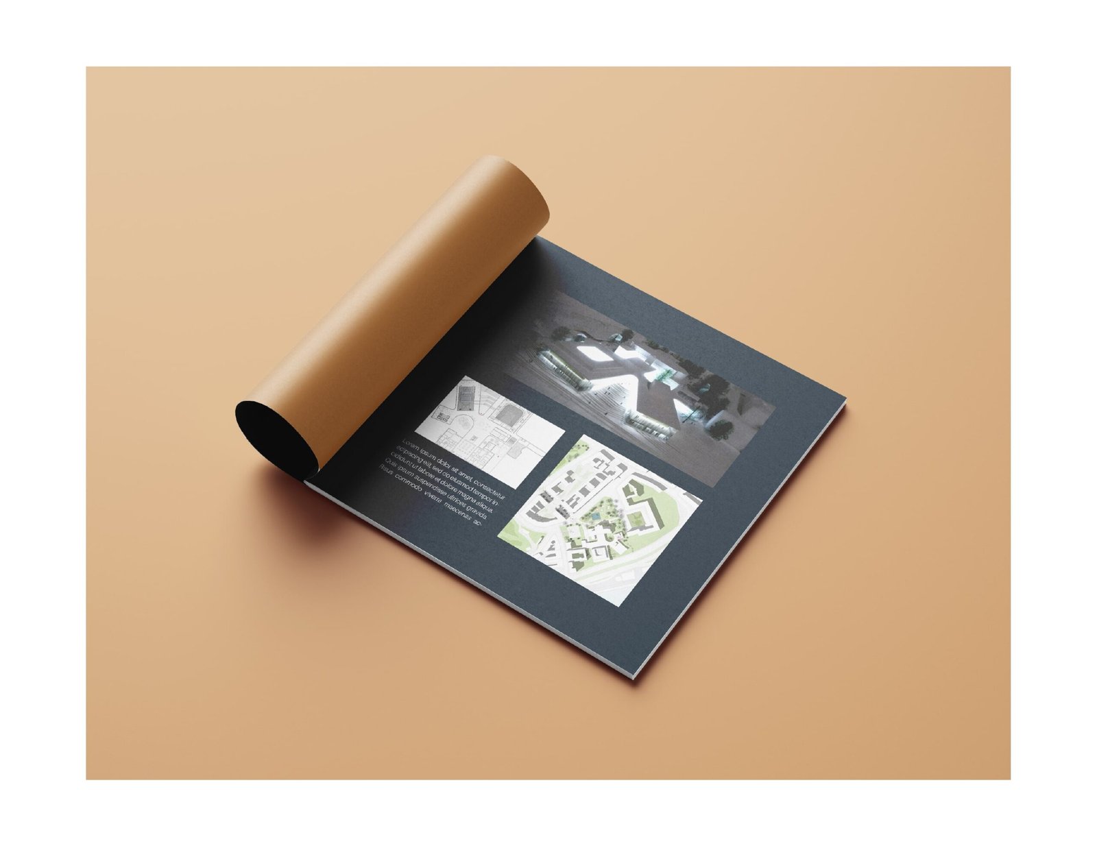
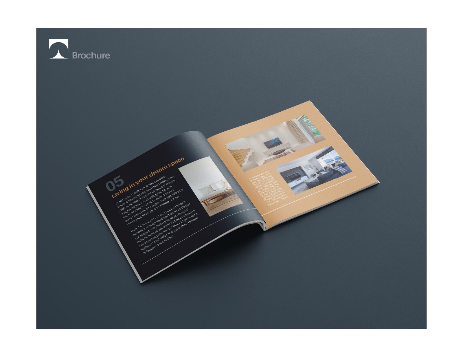
Not only did the team create the logo, but they also created one of the best visual design identities for the company. Below you can see the print material needed for advertisement to a very clean and minimal brochure design and other peripherals.

